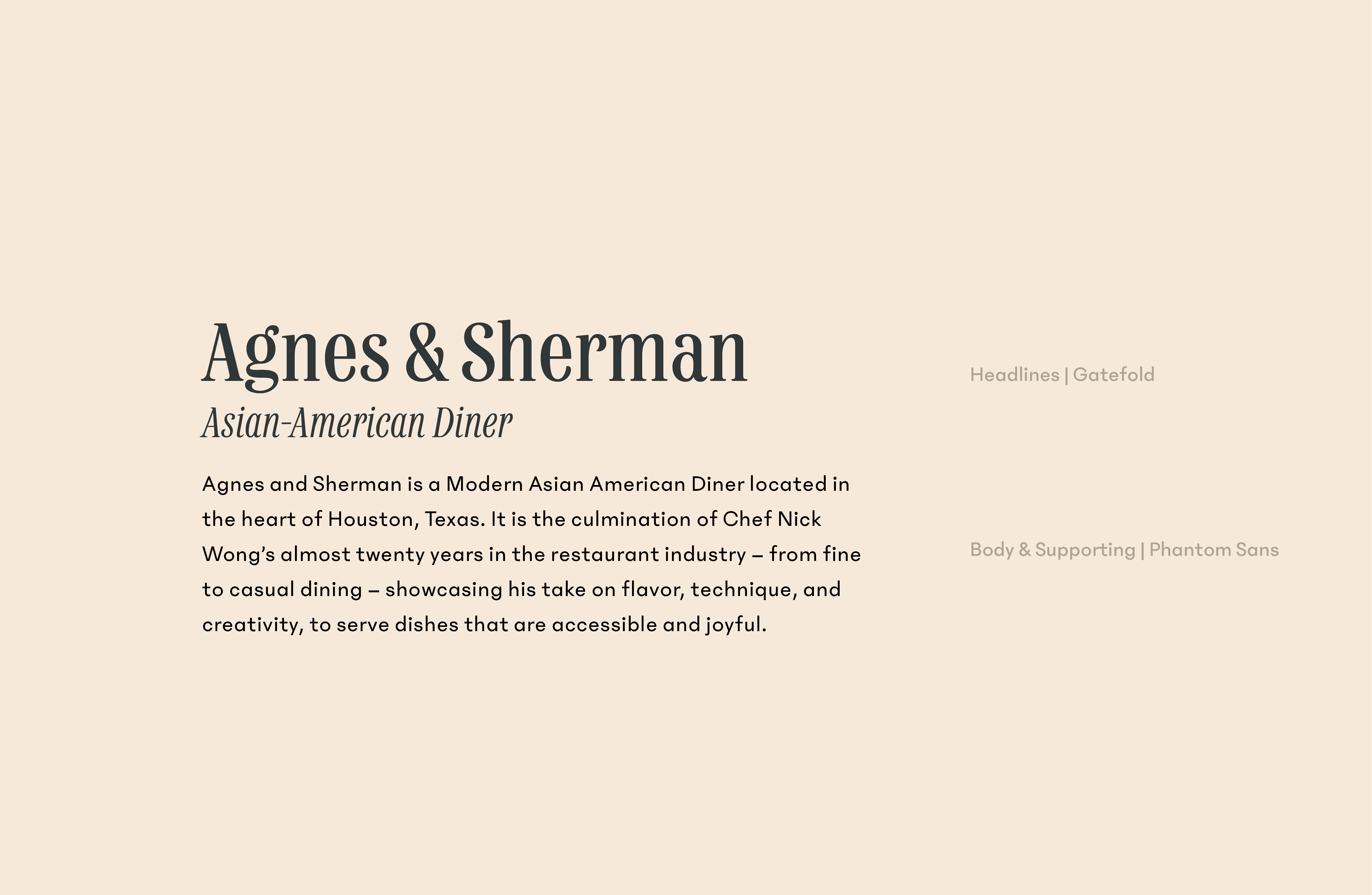
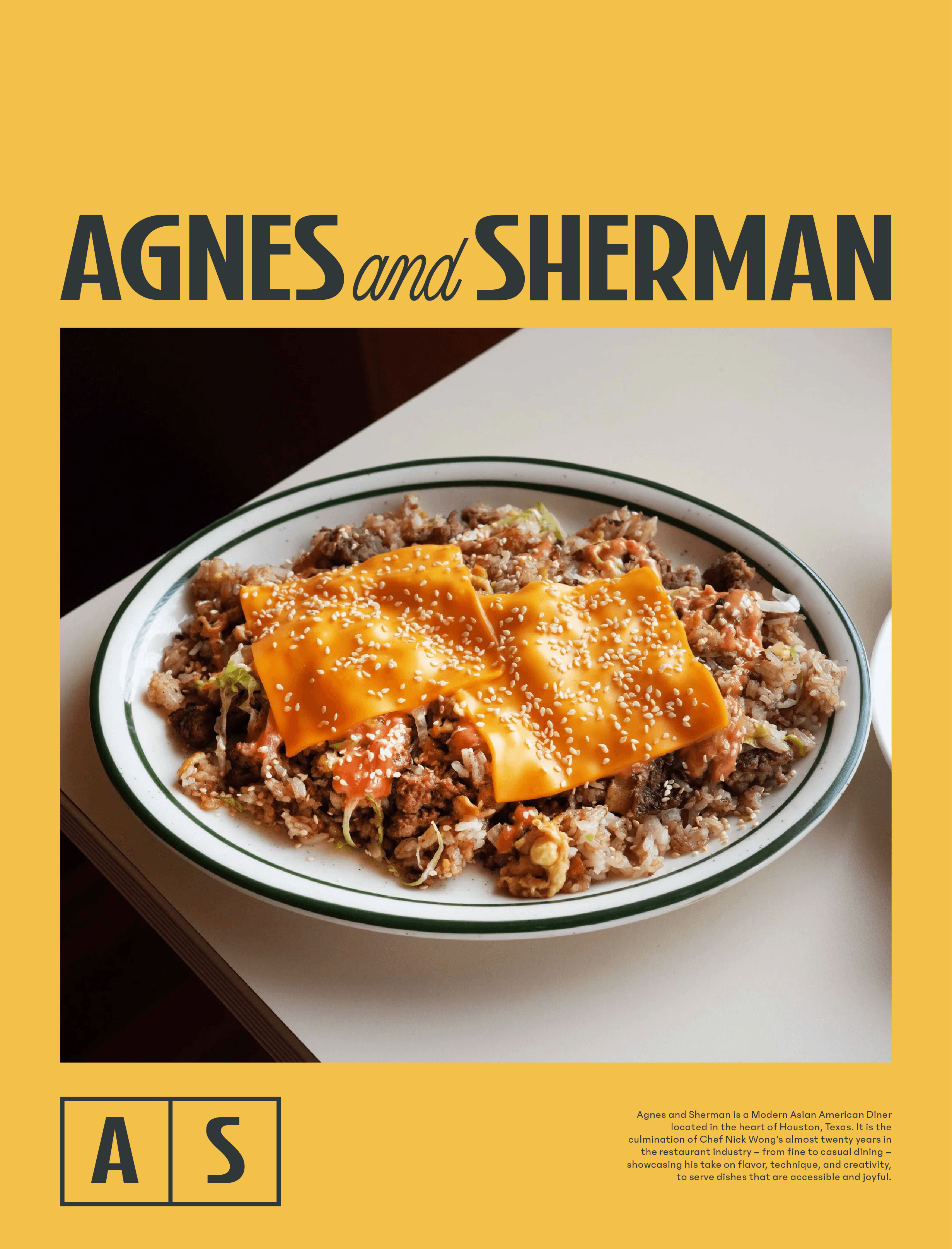
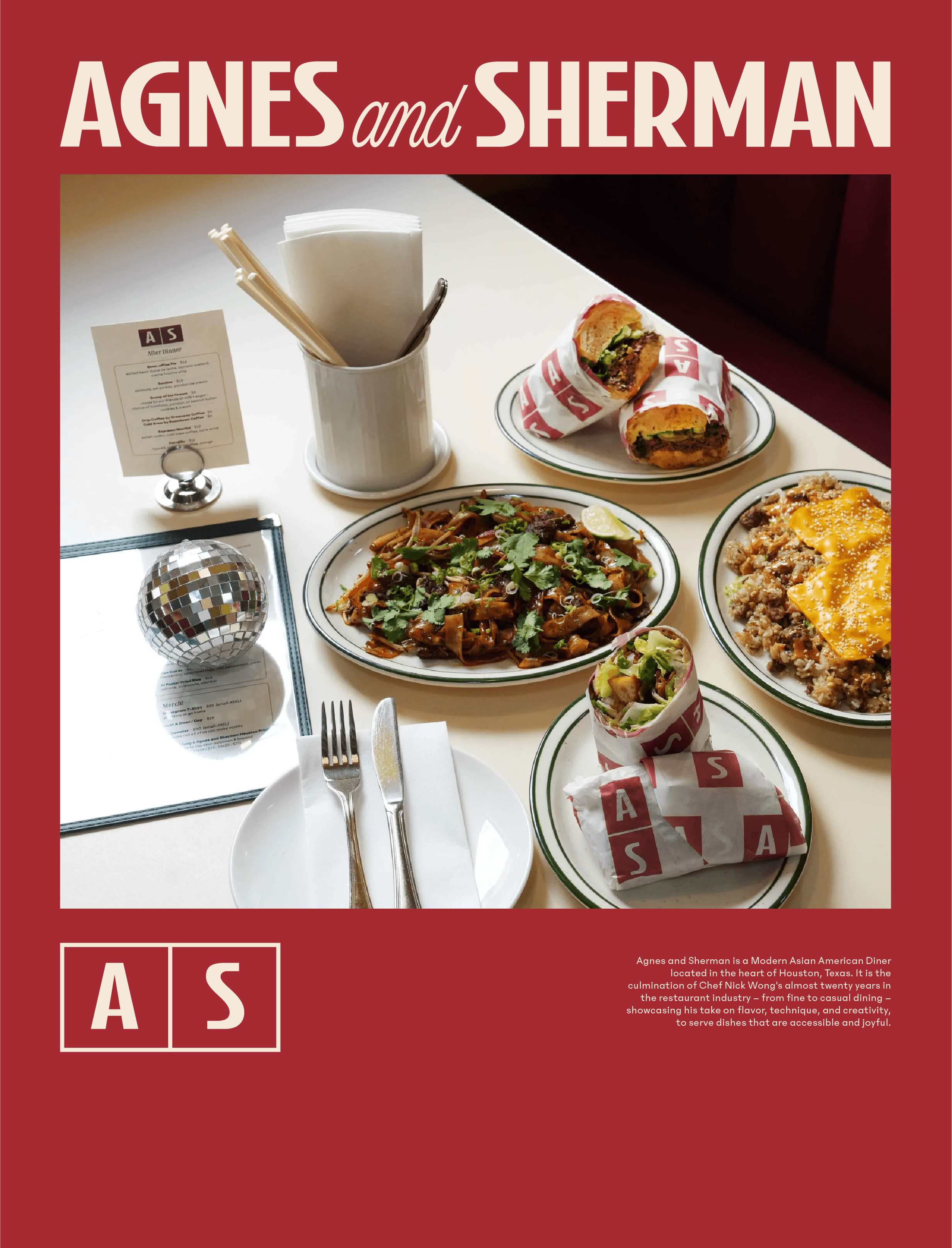
Agnes & Sherman
Branding
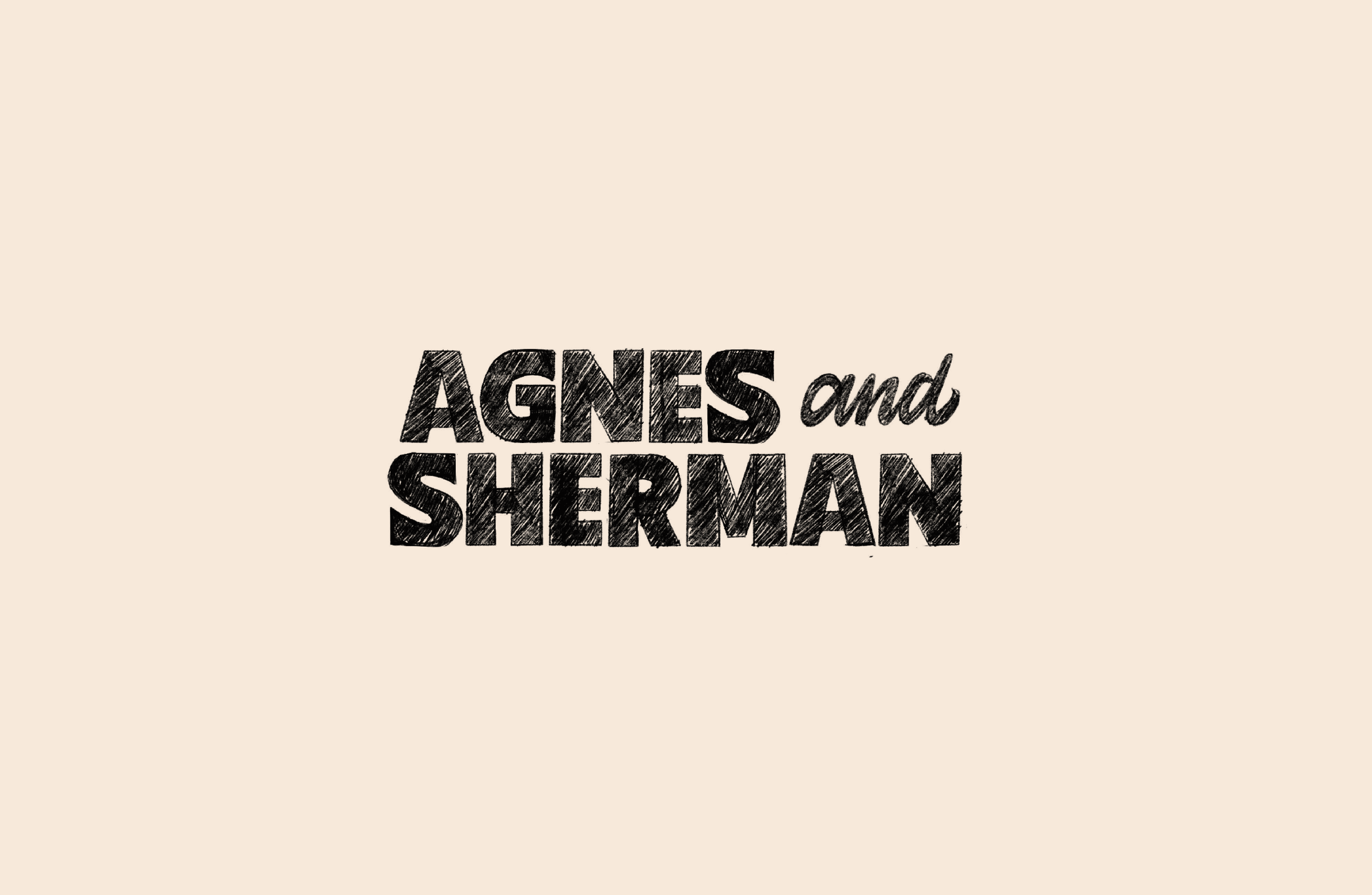
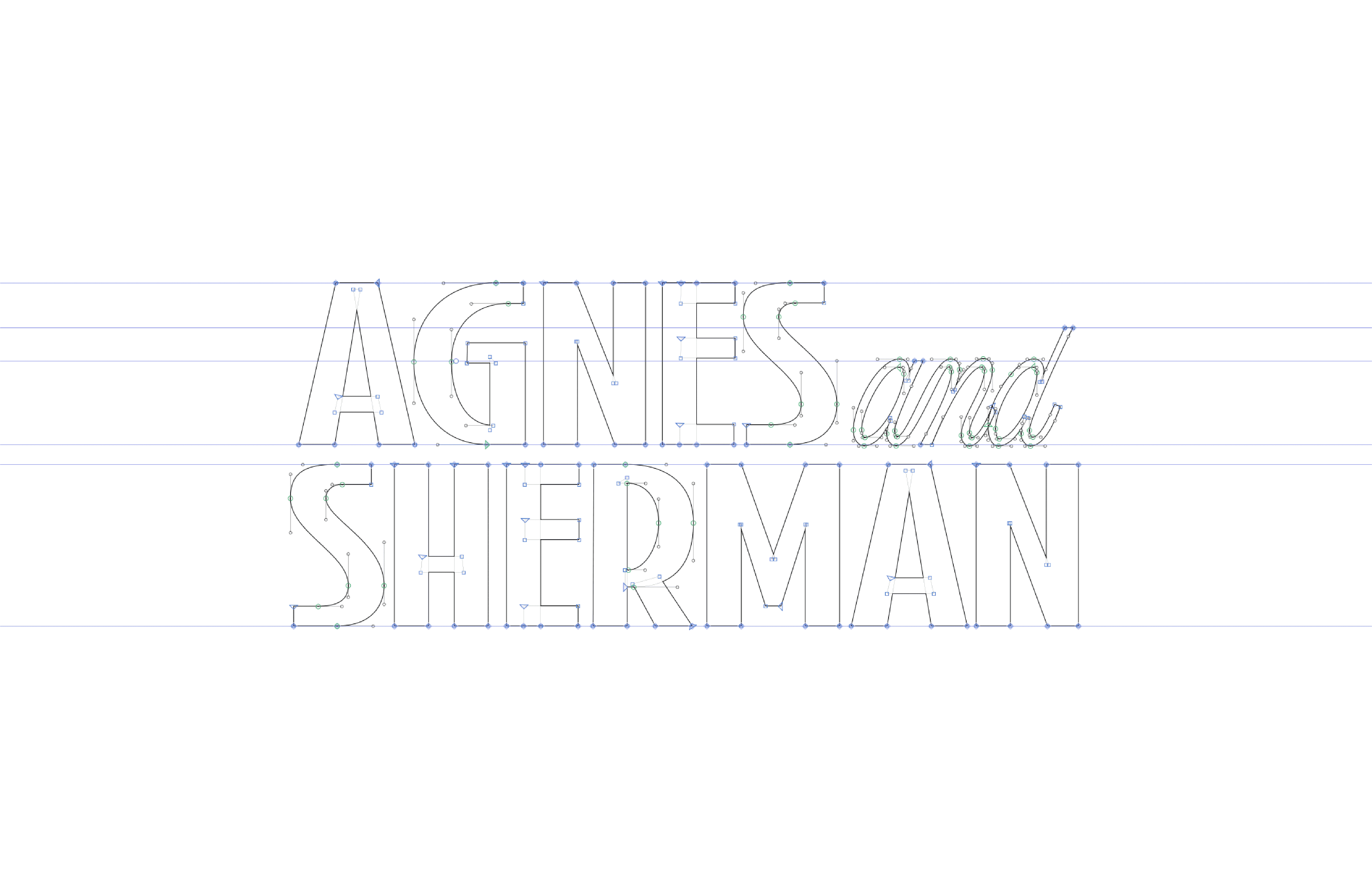
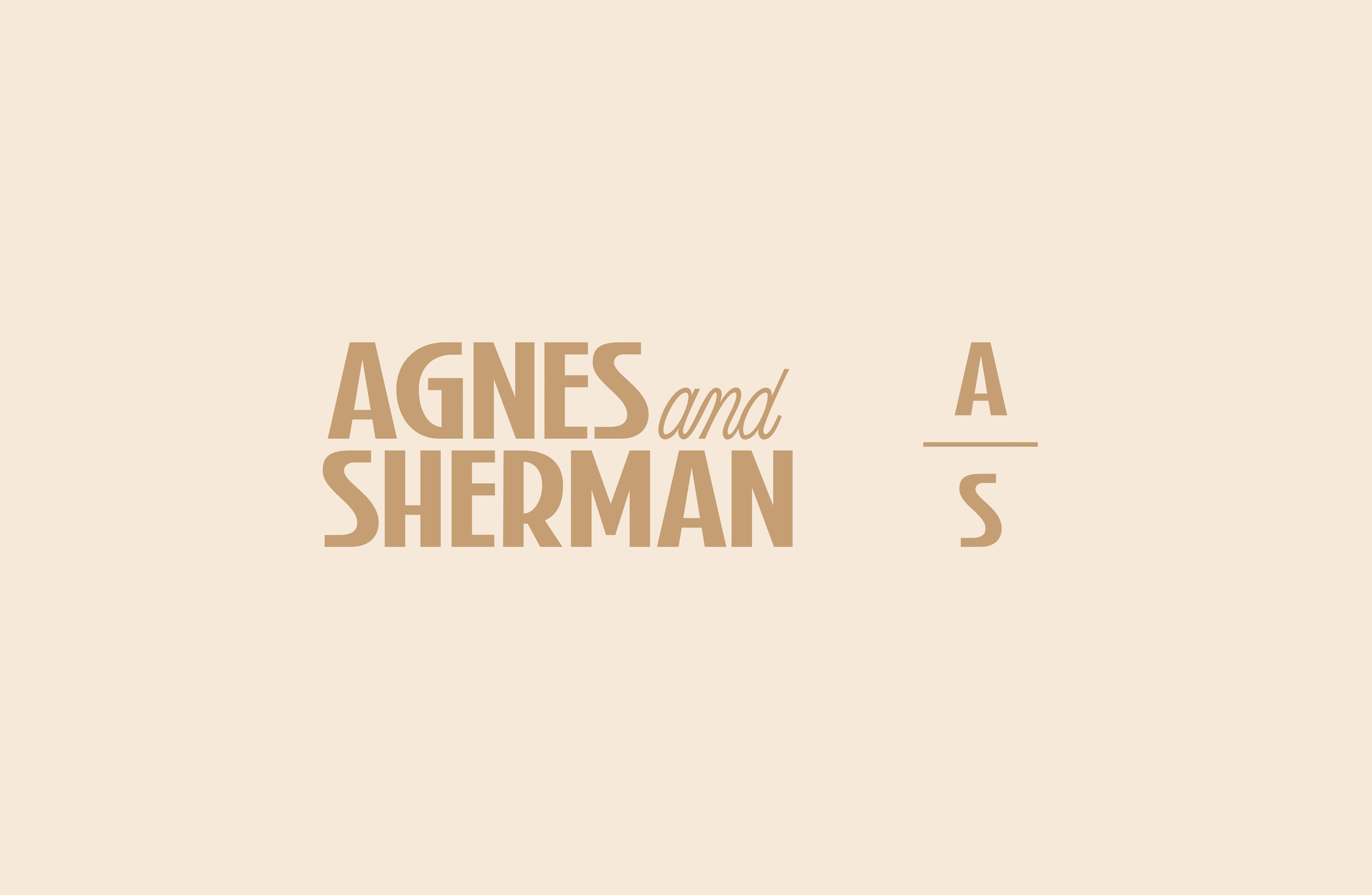
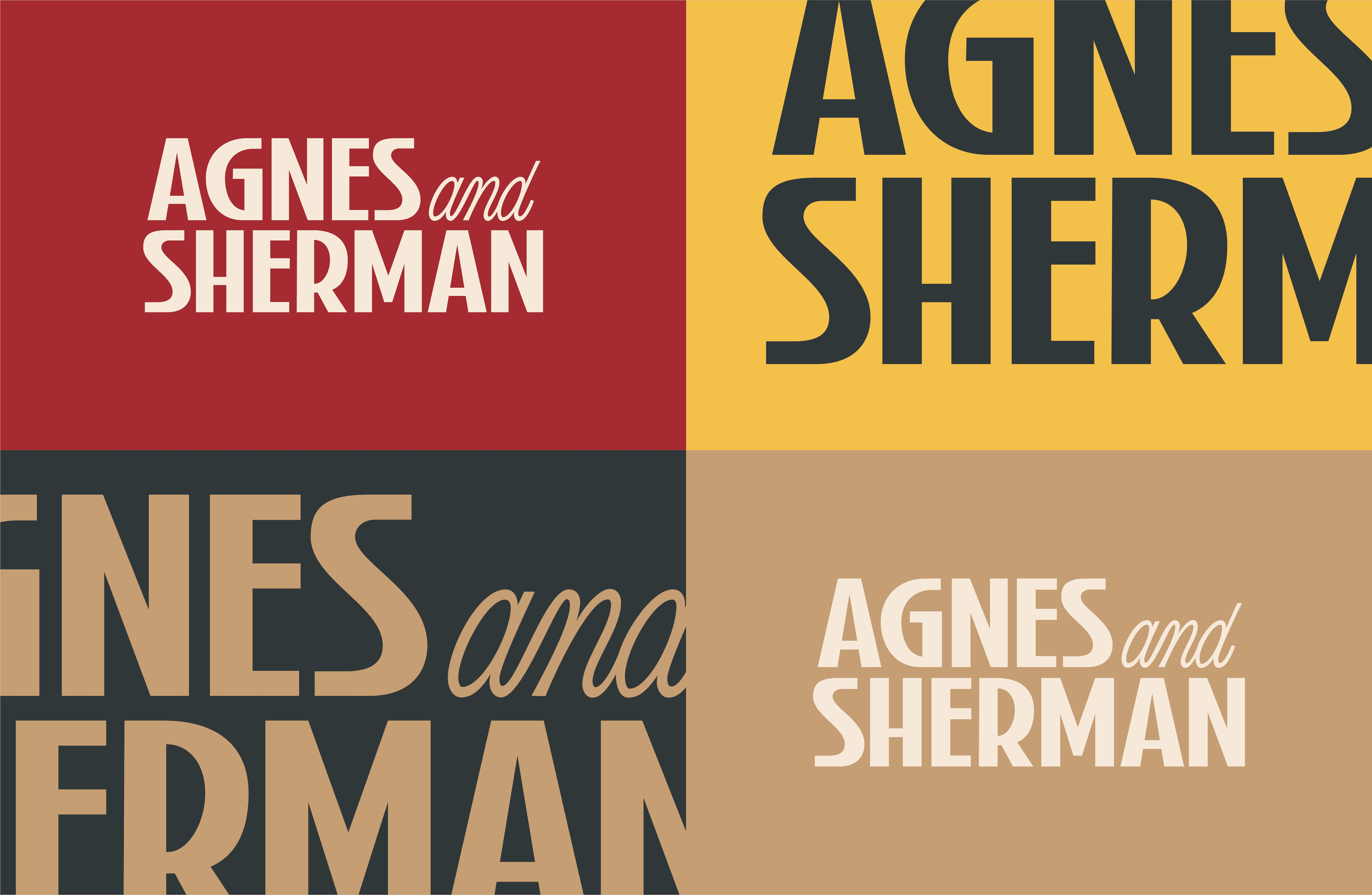
Lettering

Client Name
Agnes & Sherman
Credits
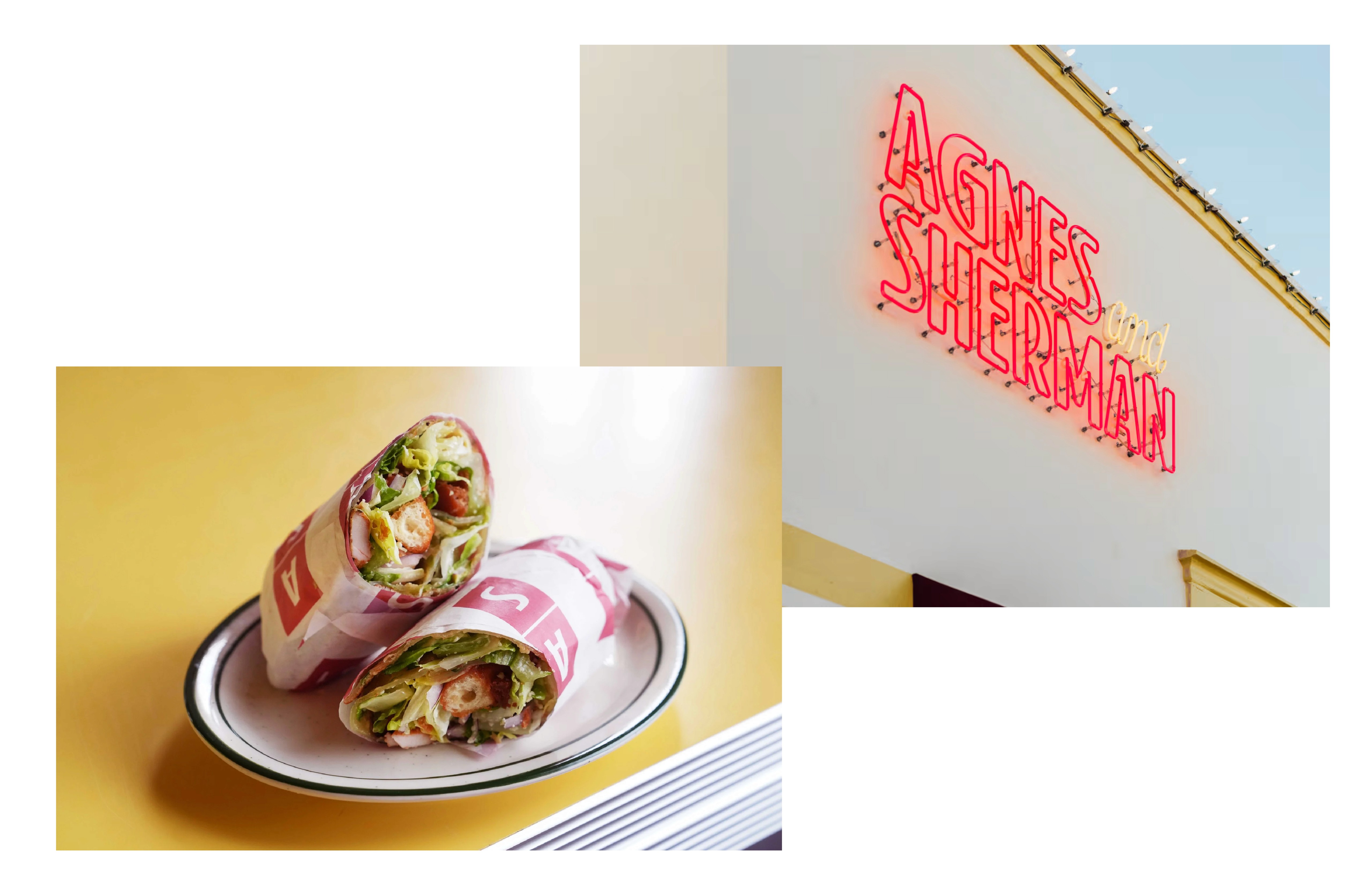
Photography - Vivian Leba
Scope
Custom logotype
Visual brand
Menu design
Business card
Client Site
About
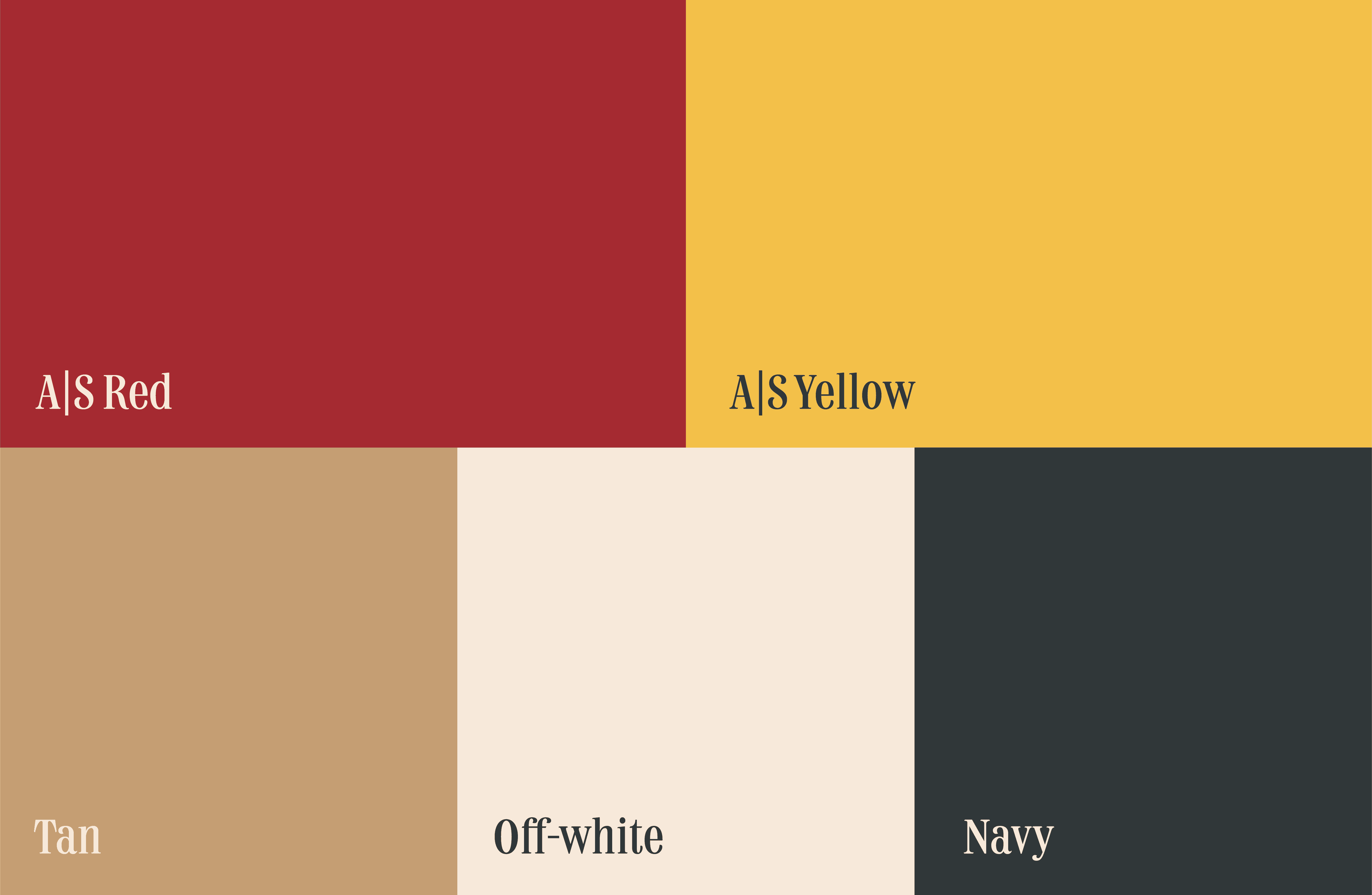
Agnes & Sherman, a Chinese-American diner that opened in 2025 in the Houston area, approached us to brand their establishment with a sophisticated, contemporary diner vibe. The owners wanted to include a subtle reference to their heritage as well the restaurant's fusion offerings, which we achieved through a monogram inspired by a mahjong tile and a color palette that includes modified reds and yellows.
In addition to branding, we designed their menus and recreated them in Canva, ensuring they have the flexibility to update their offerings seasonally with ease. This approach allows Agnes & Sherman to maintain a dynamic, on-brand menu that evolves along with their culinary creations.


The process
Nick & Lisa really wanted to make something that felt whimsical and representative of this novel idea of combining American diner vibes with the lens of Asian American food. We presented a few moodboards, got a general direction, and then went to town sketching out ideas. Typically we like to pair down our options when presenting ideas, but for this one in particular we really wanted to make sure we had a gamut of personalities that we could discuss.
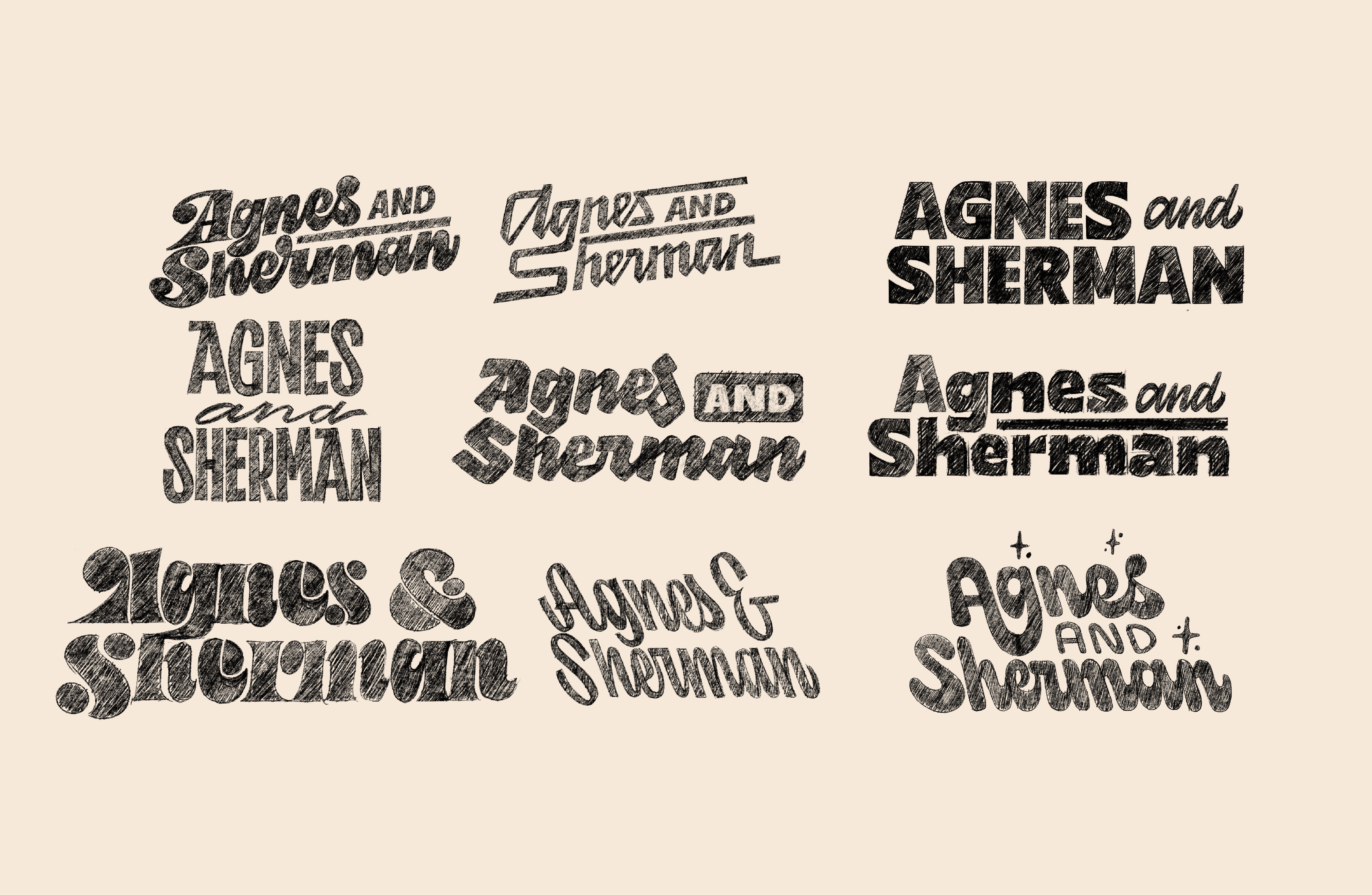
After some deliberation, we decided to pursue a slightly toned down personality for the logotype. We've usually got our favorites when working on a project, but this time around we felt any of these could work. We were happy to pursue this direction because it really felt like it nailed the personality of Agnes & Sherman: stately, nostalgic, but still has a playful personality. The final version has some very art deco tones, but in a very modern way.